Break the Mould
Branding & Packaging
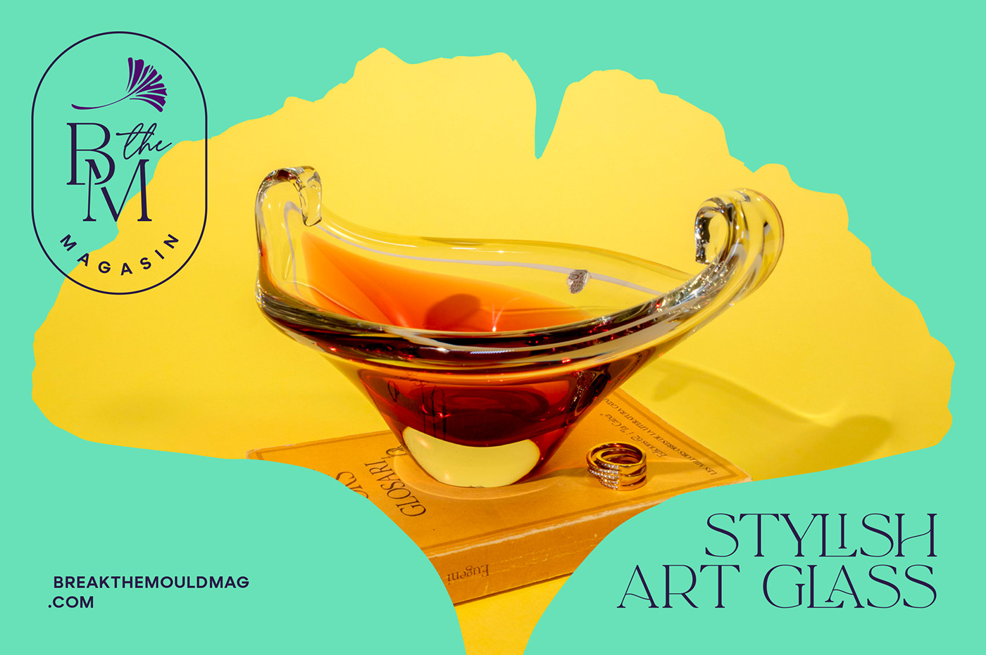
Break the Mould is an online magasin of uniquely curated vintage and small-batch handmade homeware and interior decorations, with a penchant for mid-century modern style. They believe in giving vintage items a new life, and creating new, inspiring objects in a conscious way.

Before & After:

The new brand identity is based on Gingko, which we choose as a symbol of life, longevity and eternity. Using it as a graphic sign of identity to symbolise the uniqueness that distinguishes us, and the immortality of our products.


The new logo must be aesthetically charged and with details that make it a bit vintage, just like its products. Versatile and adaptable, it has a horizontal and a compact version. It also has a stamp version for social networks and packaging.

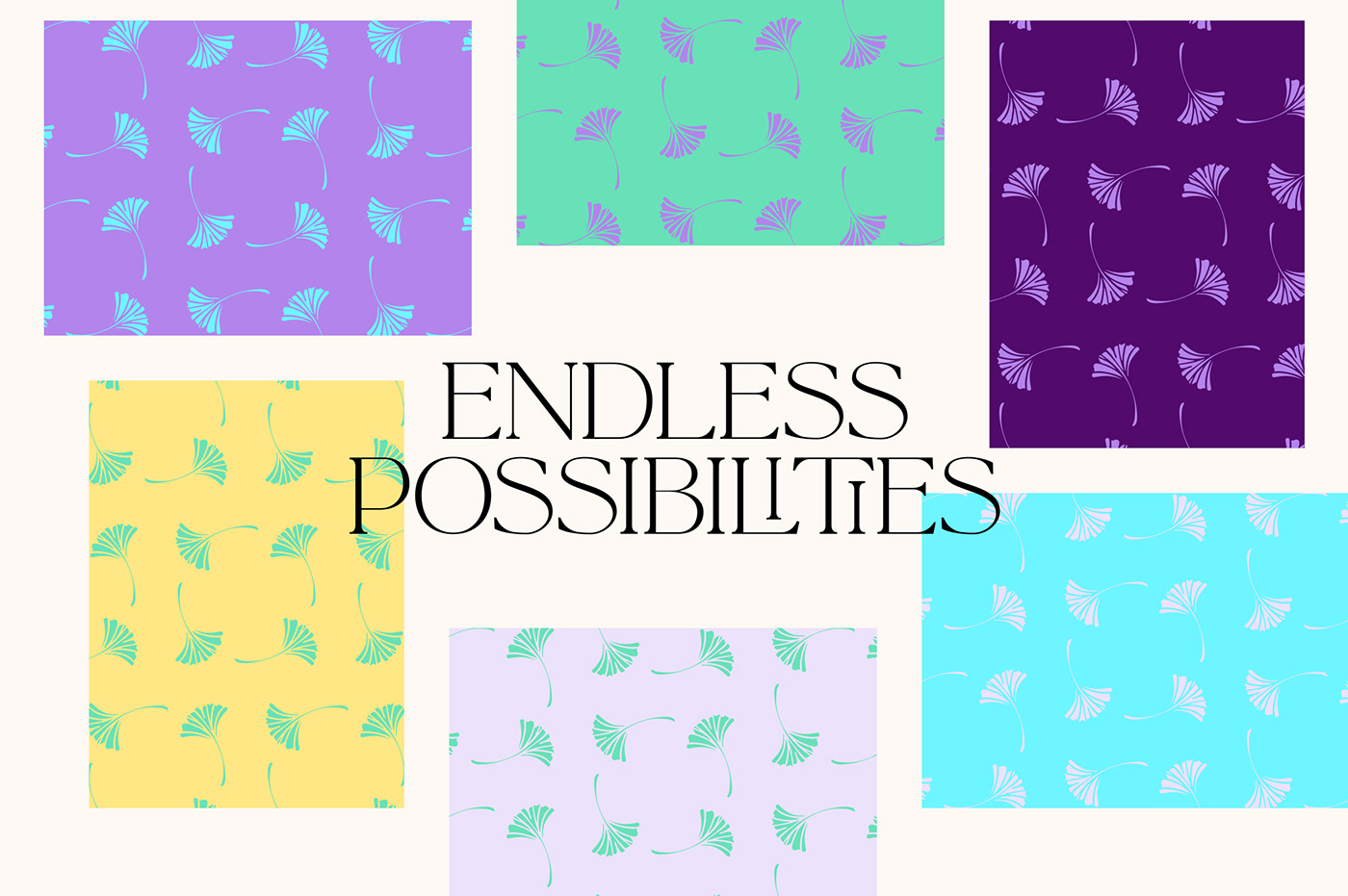
Break the Mould is a brand of colourful vintage products. That's why the brand's colour palette should reflect this wide range of colours.

The creation of a brand pattern was necessary in order to have an endless possibilities of backgrounds that could be used both on packaging and social media.


Break the Mould has its own product, the egg coaster set. A set of coasters designed by Break the Mould and handmade by a glass craft studio in Valencia. As a unique product, it needed a unique packaging.


To see more about Break the Mould products, check out their instagram here:
